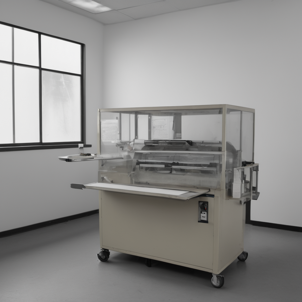
The fluorescent hum of the Annex was a steady, high thrumming sound, barely audible over the rhythmic whirring of the labeling machine. A patient care for this corner station meant noticing the small things: the faint film of dust settled on the metal rollers, the way the beige manila folders leaned against the counter's edge, and the precise alignment of every staple mark etched into the desk surface. Everything was arranged according to protocol—a meticulous cataloging of misplaced forms from decades past. The air held a clean scent of ozone mixed with old paper pulp, evidence of countless cycles of printing and sorting. We were checking inventory, ensuring that each form label matched its corresponding departmental code perfectly before filing it back into the system’s memory banks. The machine cycled through another batch, spitting out small slips of labeled cardstock onto the output tray. Most labels printed in a standard, crisp sans-serif font, neat and predictable. Yet, every time the specific municipal form for Zoning District 47 was processed, one label always emerged with an anomalous typeface—a heavy, ornate script that seemed utterly foreign to the otherwise utilitarian setting. It looked as if the machine had briefly paused its routine function to recall a much older, more elaborate era of printing. The room itself felt too clean, almost aggressively ordered, like it had been scrubbed and re-indexed moments before our arrival. As we cataloged the last stack, the labels were stacked so high they threatened to spill over, forcing us to adjust the pile slightly. Immediately, a barely perceptible shudder ran through the counter’s metal frame; the entire setup seemed to settle back into its previous arrangement, as if correcting for an imagined imperfection in the flow of time itself.
hush · calm